I’m sure many of you grab a guidebook before visiting somewhere. I certainly do my research, but I hate reading reams and reams of text. So it’s a good thing that illustrated guides to places exist, right? I mean, you can’t plan travel and logistics with them, but you can get a good idea of the things you want to see. I’ve collected some of my favourite visual guides to cities around Europe.
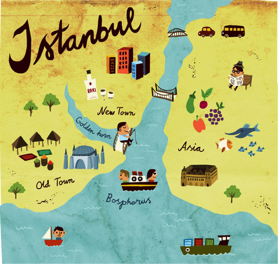
Mikko Walamies
Mikko’s guide to Istanbul gives visitors a few ideas for things to do: there’s a boat trip across the Bosphorus, the Old Town, the opportunity to do some fishing, and of course the chance to drink copious amounts of Raki.
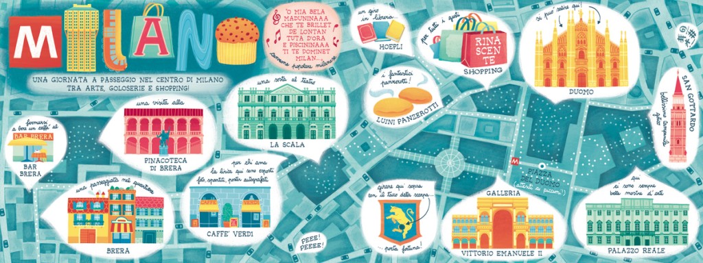
Silvia Sponza
Silvia’s guide to Milan has lots of suggestions for potential visitors. There’s all the famous buildings and landmarks, as well as the best places to go shopping, and what kind of foodie treats you can try.
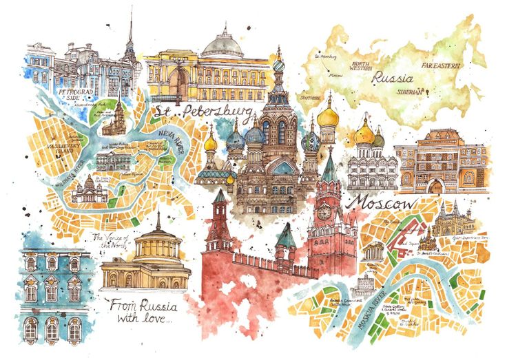
Jess Stewart-Croker
I’m a big fan of Jess’s work, so was pleased when I came across her lovely watercolour guide to Russian cities, Moscow and St Petersburg. She has illustrated a large majority of the famous buildings, paying close attention to the detail in Russian architecture.
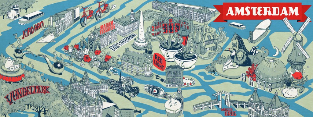
Elyse Salazar
Elyse’s guide to Amsterdam is laid out in a map form, but still has some great suggestions for things to do. There’s Vondelpark, the Red Light District, the representation of how popular cycling is, and numerous illustrations of attractions.
Anna Simmons
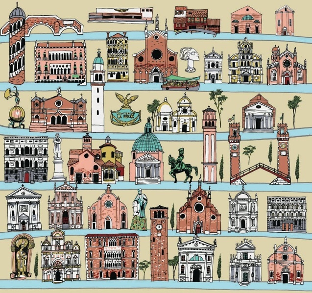
Can anyone guess where Anna Simmons illustration portrays? Yup, it’s Venice. Here, she has highlighted some of the famous buildings all laid out neatly in a kind of ‘tick box’ style.
Dermot Flynn
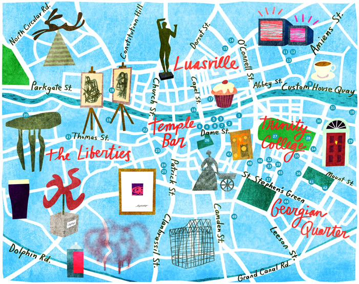
Dermot’s illustration depicts the art galleries and museums in Dublin. With this you can plot which institutions you want to visit and where abouts they are in the city. In addition, there’s suggestions for places to eat and drink that much needed pint of Guinness.
Madi Andronic
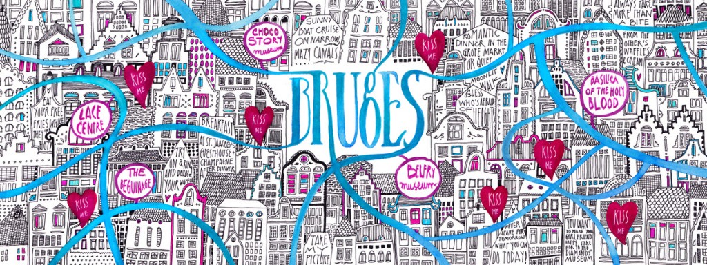
I’m heading to Bruges in a couple of weeks, so I had to include this illustrated guide by Madi. She has intricately drawn many of the famous buildings, and has also pointed out hotspots to check out.
Patrick O’Leary
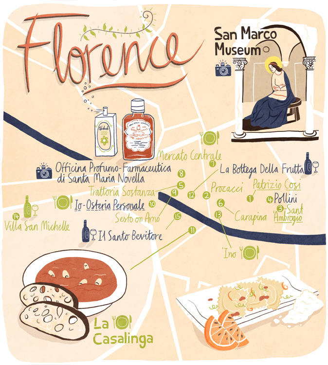
Patrick’s guide to Florence places heavy emphasis on places to eat and drink – and who can blame him? Italian food anyone?
Tilly at running for Crayons
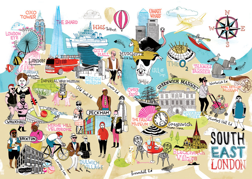
Tilly’s map of South East London may look busy, but that’s because there’s so much to do there. She has highlighted all the quirky places to visit, as well as some old favourites, and what to expect from each area.







Very cool! I always love guides like these, not only because of the beautiful visuals, but also because of the idea behind it that tourism boards actually work together with artists to create maps like these.
Absolutely, Lydian! I love the collaborative approach.
I love illustrations like this. As much as I love maps, their functionality, and their diversity (esp. urban transport maps of London, Berlin), these illustrated maps portray a very personal flavour to a neighbourhood, a city, her residents. Thanks for highlighting this great work, Lizzie!
I completely agree… I love seeing how other individuals view a place, and these illustrated maps give the perfect insight!
Love these!
They all look so cool. My favourite is Florence.
I love the Florence one, too
This is awesome.
I’m a big fan of illustrated maps and guides
So gorgeous – I’d love to have one of either one of my cities!
So great, aren’t they?!
I am not a guide book person anymore with the availability of online resources- but I love these illustrations. I would actually love these to frame for my office!
Same here, I think I’ve only used a guidebook once or twice before and even then it has been someone else’s that I have borrowed! I think these would look fantastic hanging in an office – would certainly liven it up!