I’m a sucker for illustration, especially vintage style pieces like the work of Sam Brewster, an English illustrator. He creates weekly illustrations of cities around the world for Beer Advocate Magazine which show places like Prague, London, and San Francisco in a brilliant, new way. Here, I chat to him about his inspirations, as well as the places he’d love to illustrate in the future. Enjoy!
Your illustrations have a very unique, vintage style to them. How did this develop?
I was always a fan of pre-TV advertisements and old printing methods – the style that I’ve developed was a conscious decision to emulate some of the bits that I love from both fine and commercial art.
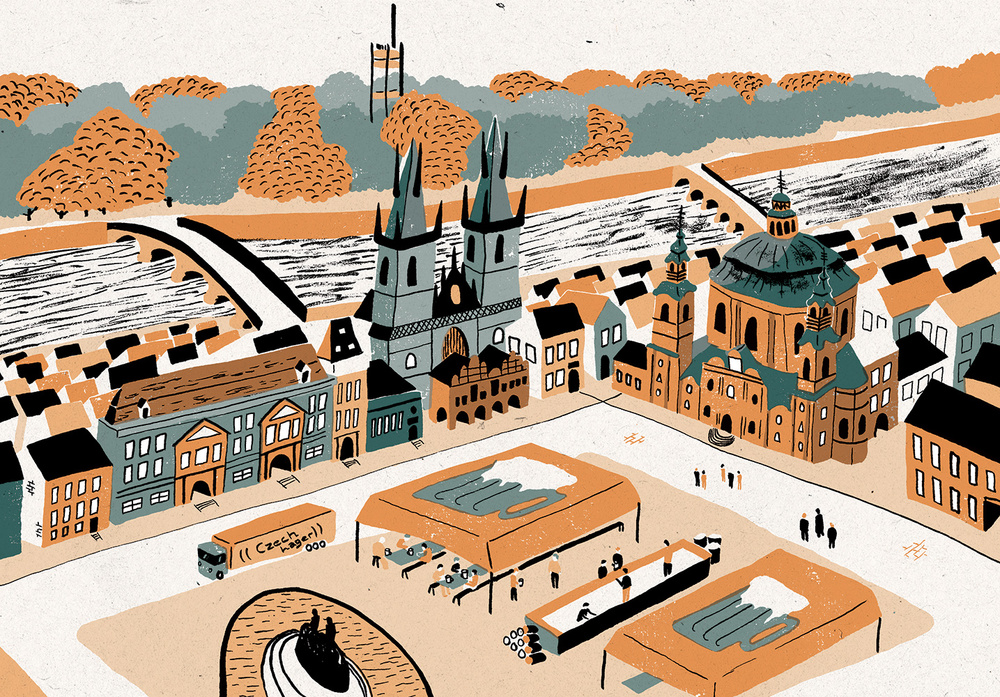
Prague, Czech Republic
Let’s talk about process. What are the steps you take when creating each piece?
Everything starts with a hastily sketched idea, jotted down whilst I’m reading the brief or article. Visual cues and the like. Sometimes the idea is right there at the beginning and other times I have to work a little harder to find the best solution. Once the idea is decided upon, the rest is a breeze; I develop the initial sketch into a well-worked pencil sketch which then becomes the template that I use to trace out all of the colour layers. These then go onto my laptop and become the final piece.
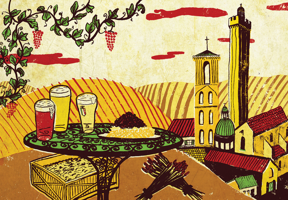
Bologna, Italy
Why cities? Why not landscapes or people, for example?
The cities that I’ve illustrated (in fact, all the work on my website) has been made to commission. It just so happens that the cities that I have drawn were picked for me by Beer Advocate Magazine, in which I illustrate a monthly column where they review a destination’s craft beer scene. I’ve been working for the magazine for almost three years now, so there’s over 40 illustrated cities in my backlog for that client. I do draw people and different scenes for other clients too, which you can see on my website.
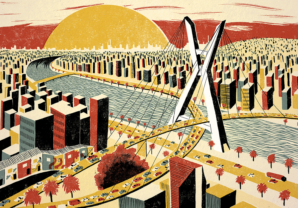
Sao Paulo, Brazil
What inspires your work?
I love to portray ideas in a visually interesting and eloquent way. That’s what I always try to do with any visual medium – whether it be illustration, photography film or madcap hand gestures.
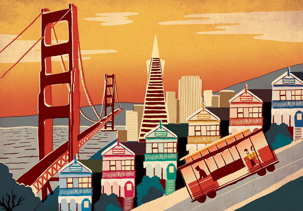
San Francisco, USA
What do you hope each illustration tells the viewer about the place it depicts?
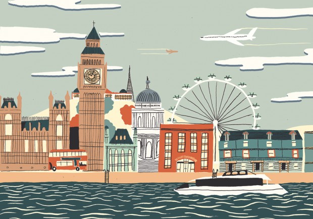
Each illustration is intended to capture the essence of the place, by amalgamating recognisable landmarks or using a colour scheme that reflects the vibe of a place. As I’ve not visited many of the places that I’ve illustrated I have to do a lot of research, however sometimes fresh eyes on a place can be beneficial in picking out what makes it interesting.
London, UK
Where has been your favourite place to illustrate and why?
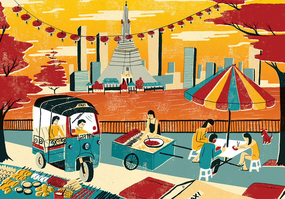
So far it has probably been Bangkok, Thailand, because there’s such a wealth of vibrant imagery in that part of the world. The colours are so vivid. Plus, having been there, I could draw on a lot of personal experiences – it really took me back there whilst working on the piece.
Bangkok, Thailand
Finally, if you could illustrate anywhere in the world, where would it be and why?
Hmm, that’s a tough one. I’d like to illustrate many more! I’ve yet to have a go at Reykjavik, Vancouver, Rio, Mostar, Havana… Oh and Sheffield (UK), because it’s the place that I spent a good portion of my childhood.
You can see more of Sam’s work on his website.
What do you like about Sam’s work? How do you think his illustration style reflects these cities? Let us know in the comments!
Finally… Musement, a site offering museum tickets, art tours, and cultural activities has kindly let Wanderarti readers get €5 off purchases up until the 31st July. Just use the code WANDERARTI and you can get discounted offers all over Europe!

